Most popular styles in Web-design
There are several web design approaches that are commonly used for many projects. Depending on what you need, you should choose a specific style.
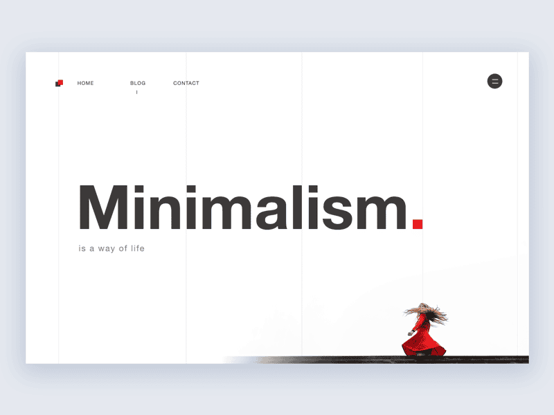
Minimalism
Despite the fact that many web-site customers often try to fill it with the maximum amount of various information in the form of texts, images and animation, as well as to make the page functional, in some cases this approach does not work and it is worth turning to the principle of "Less is more", which leads us to an idea "Better less, but better". In other words, to develop a website in a minimalist style.
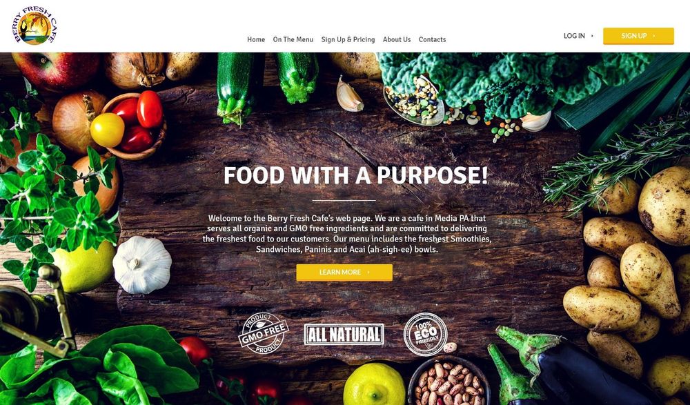
Organic & natural
The essence of the Organic & Natural style is already visible in its name: the design of this direction implies the use of various "natural" textures, for example, grass or wood, as well as graphic filling of landscape and vegetable themes. The areas of application of organic style in web design are diverse, because the main emphasis falls on the visual series, not the features of the structure of the page or its information content.
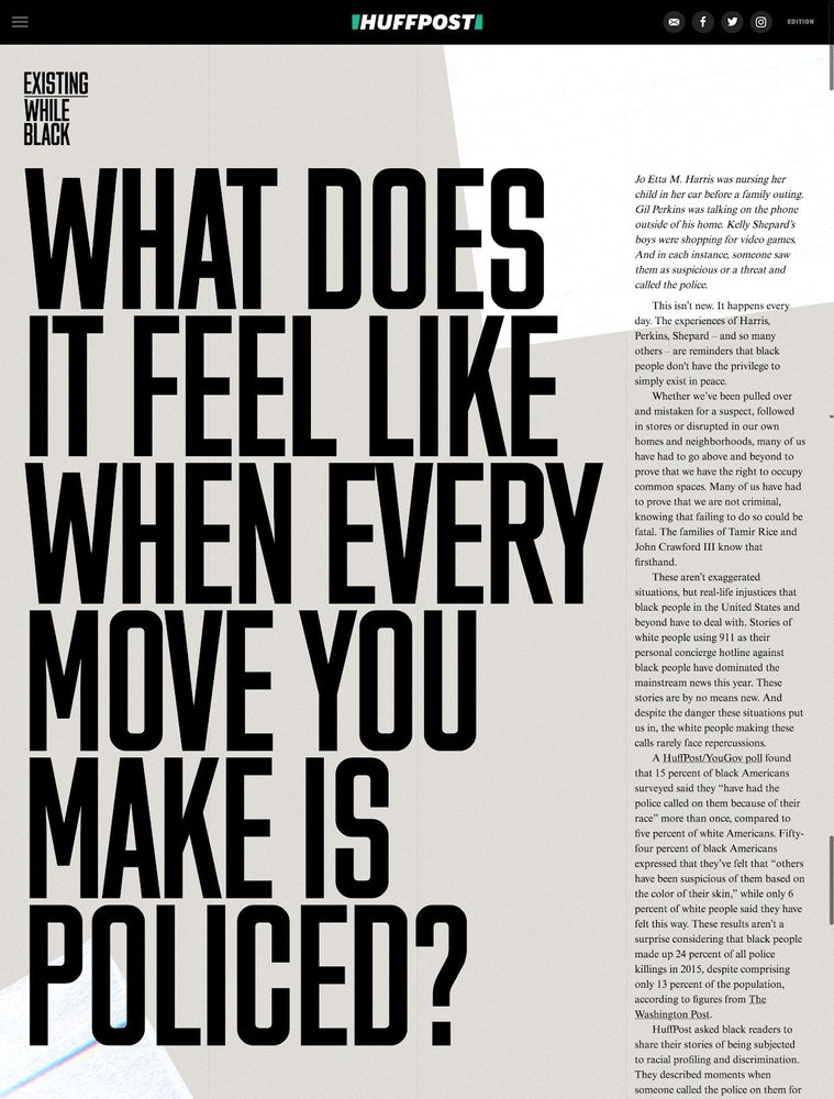
Beautiful typography
The "Beautiful typography" style is something between newspaper and hand-drawn style, or rather, combines them in itself. Nevertheless, the differences are very significant. Thus, unlike the newspaper, the typographic style implies the use of bright and non-standard fonts, but, unlike the drawn one, the main emphasis in it falls not on graphic, but on the text context. Thus, this style is ideal not only for creating personal business card sites, but also for the design of landing and promotional pages, online stores and even corporate websites.
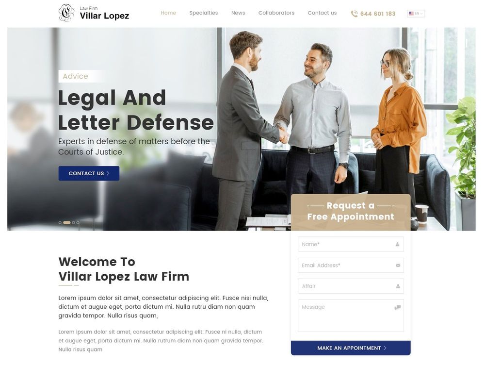
Classic style
As you know, classics never go out of fashion. That's why the classic style in website design is one of the most popular. Often, sites in this style are ordered by companies providing services in the field of finance, jurisprudence or analytics. In short, those who want to demonstrate seriousness, stability and reliability with the help of their site.
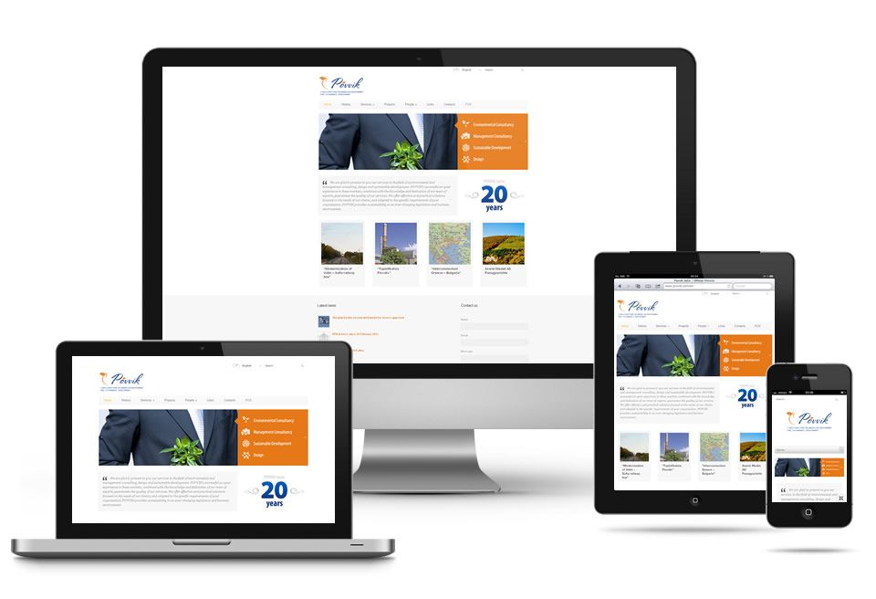
Responsive
Responsive style or adaptive style arose as a consequence of technological progress. Since there are a large number of devices with which you can view sites, it became necessary to find a style that will allow the site to look equally organic on a smartphone or tablet, as well as on a desktop computer or laptop. The main distinguishing feature of the adaptive style is that the design of the site begins with the mobile version.
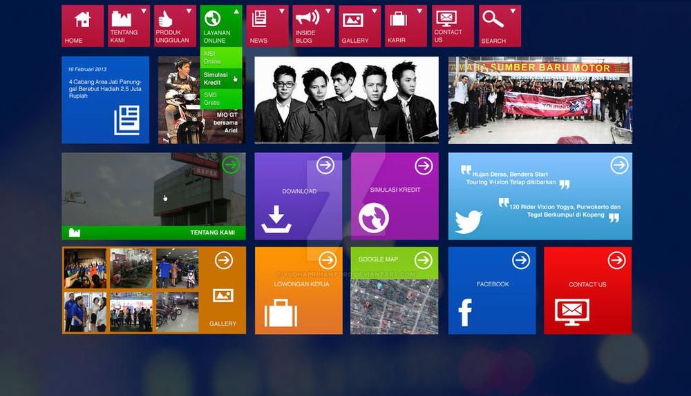
Corporate style
Corporate style should be fully subject to the requirements and objectives of the company, and should also have a clear structure. The page should look strict, however, the presence of graphics and animation, as well as non-standard fonts is allowed. It is mandatory to place not only the name, but also the company logo, as well as its motto. Often, the site is based on the corporate style of the company itself.
Skeuomorphism
Skeuomorphism in design implies the use of elements that repeat the shape of a different object or material, however, made by a different method or from other materials. The areas of application of the skeuomorphism style are extremely diverse. For example, various decorative elements made of plastic, with wood processing, and the like are very popular in the automotive industry. This style came to web design in 2011 and immediately gained quite wide popularity.
Google material design
The Material style was introduced in 2014 and was an attempt by Google to unify and set the appearance of its products under a single standard, both in web and mobile applications. This style has become a kind of compromise between minimalism and skevomorphism. On the one hand, this style is characterized by "materiality", which creates the impression of interaction with real physical objects, and on the other hand, simplicity and conciseness both in terms of graphics and composition.
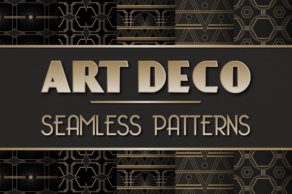
Art Deco style
For those who are far from minimalism and excessive restraint of classics or corporate style, but at the same time do not like the abandonment of ethnic style will surely like the bright and daring web design in the Art Deco style, because it is this direction that leaves a huge space for imagination and allows you to implement even the most daring solutions with full confidence.
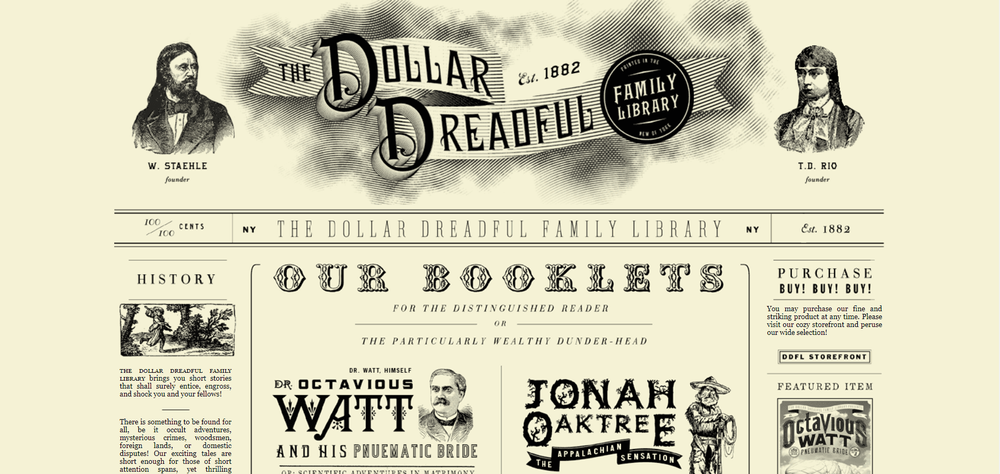
Retro
Based on the latest trends in web design, it should be noted that the retro style is now quite widespread and will not go out of fashion for quite a long time. However, in order to determine the characteristic features of this style, it is worth accurately indicating what exactly applies to retro.
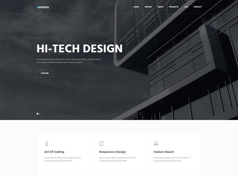
Hi-tech
The high-tech style originated in the 1970s in architecture, however, it began to be used in interior design only a decade later. With the development of modern technologies, this style was not limited to real space, but also quite organically joined the field of web design. The main distinguishing feature of this style, which makes it somewhat similar to minimalism but significantly distinguishes from industrial style and futurism, is the almost complete absence of any decorative elements, since beauty was sacrificed for the sake of functionality.
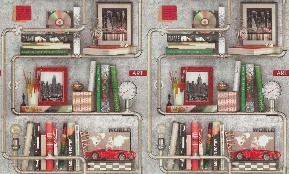
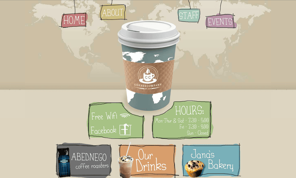
Drawn style
Unlike many other styles, such as art deco or high-tech, which came into web design from architecture or interior design, in hand-drawn, or, as it is also called, sketch style, everything happened exactly the opposite: initially it was invented for the design of sites and only then its elements began to be used in various interior elements.
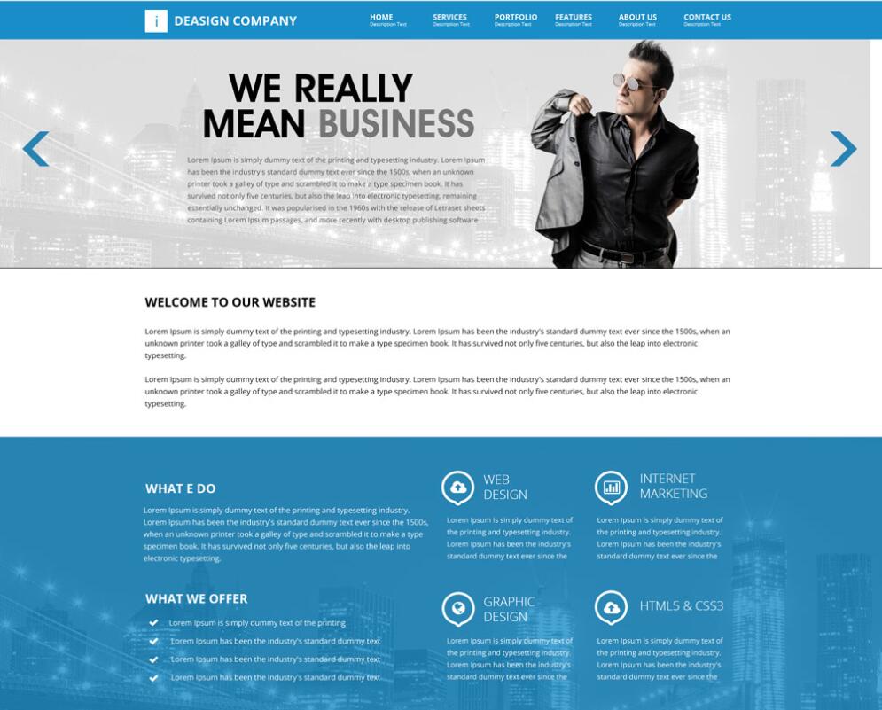
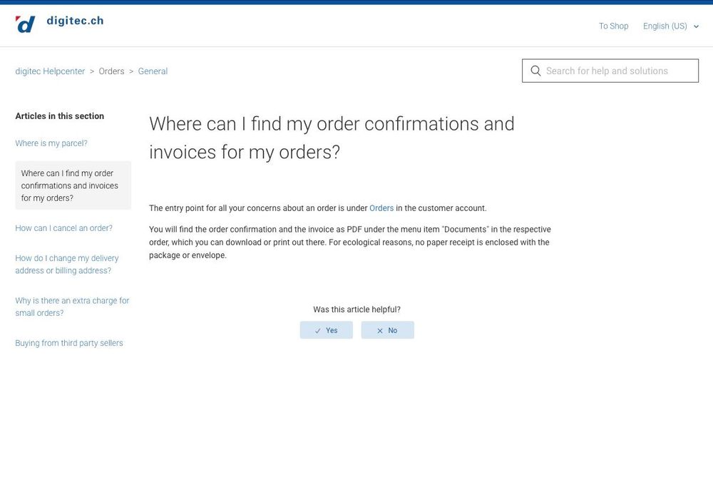
Informational style
The information style in web design is often underestimated, believing that it is suitable only for news portals. However, the possibilities of this style are much wider, and therefore it can be safely used both for personal business card sites and for large corporate portals.
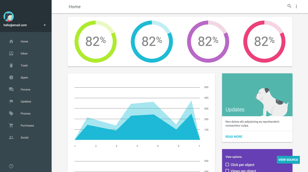
Metro
The Metro style was introduced by Microsoft in 2010 and has not lost its relevance ever since then, because its minimalism and, at the same time, its wide color palette and original typography leave ample enough space to implement even the most daring ideas. Moreover, since this style was based on the concept of adaptability, Metro-style pages look equally good on any device: from desktop computers and laptops to smartphones and tablets.
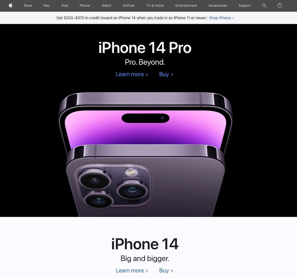
Apple style
Speaking of Apple's style, many customers mean the website of the company itself. At the same time, it is very important to distinguish between the desire to do "the same" or, in other words, just copy the site, and to recreate the general concept, which is based on high quality, minimalism and strict hierarchy in the placement of information blocks. And if in the first case the site, strangely enough, turns out to be quite boring and does not stand out among millions of similar ones, then in the second - an absolutely unique page that will definitely be remembered by every visitor.
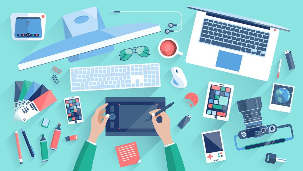
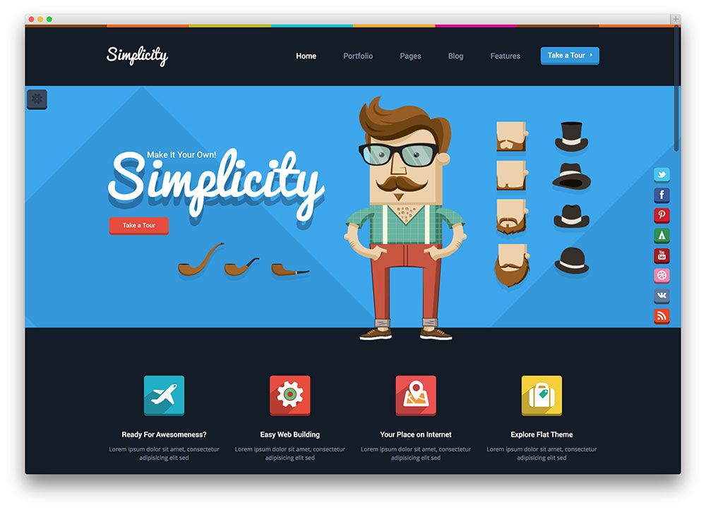
Flat design
Flat or flat style appeared in 2012 and replaced skeuomorphism with its realism and volumes, bringing in return minimalism and two-dimensionality. Despite this, this style can by no means be called boring or ordinary, since the widespread use of interesting and unusual typography, bright colors, large images and even videos allows you to create unique projects and successfully implement complex tasks.
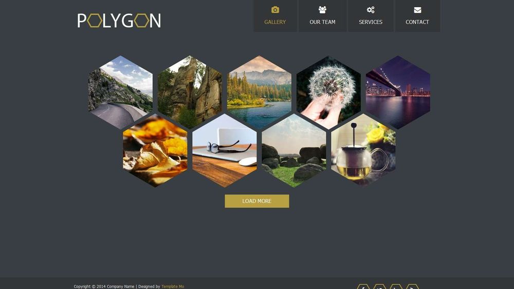
Polygonal style
Polygonal style inspires with its simplicity and variety of decorative effects that can be achieved by a gradient transition of shades of the same color. This style has become a printing and web trend in the field of website design in a very short time.
As you can see there are multiple different options for a web-design. Feel free to contact me, and we can discuss which one fits your project better.