Telematic.Pro Gets Northern Lights in Its Interface and a New Payment Page
We recently explained why we rebuilt Telematic.Pro from scratch. The product keeps evolving, and this latest update is all about the visuals: the interface has become noticeably richer without giving up any of its speed.
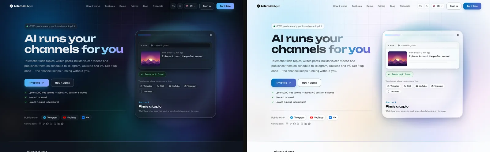
The Aurora design layer
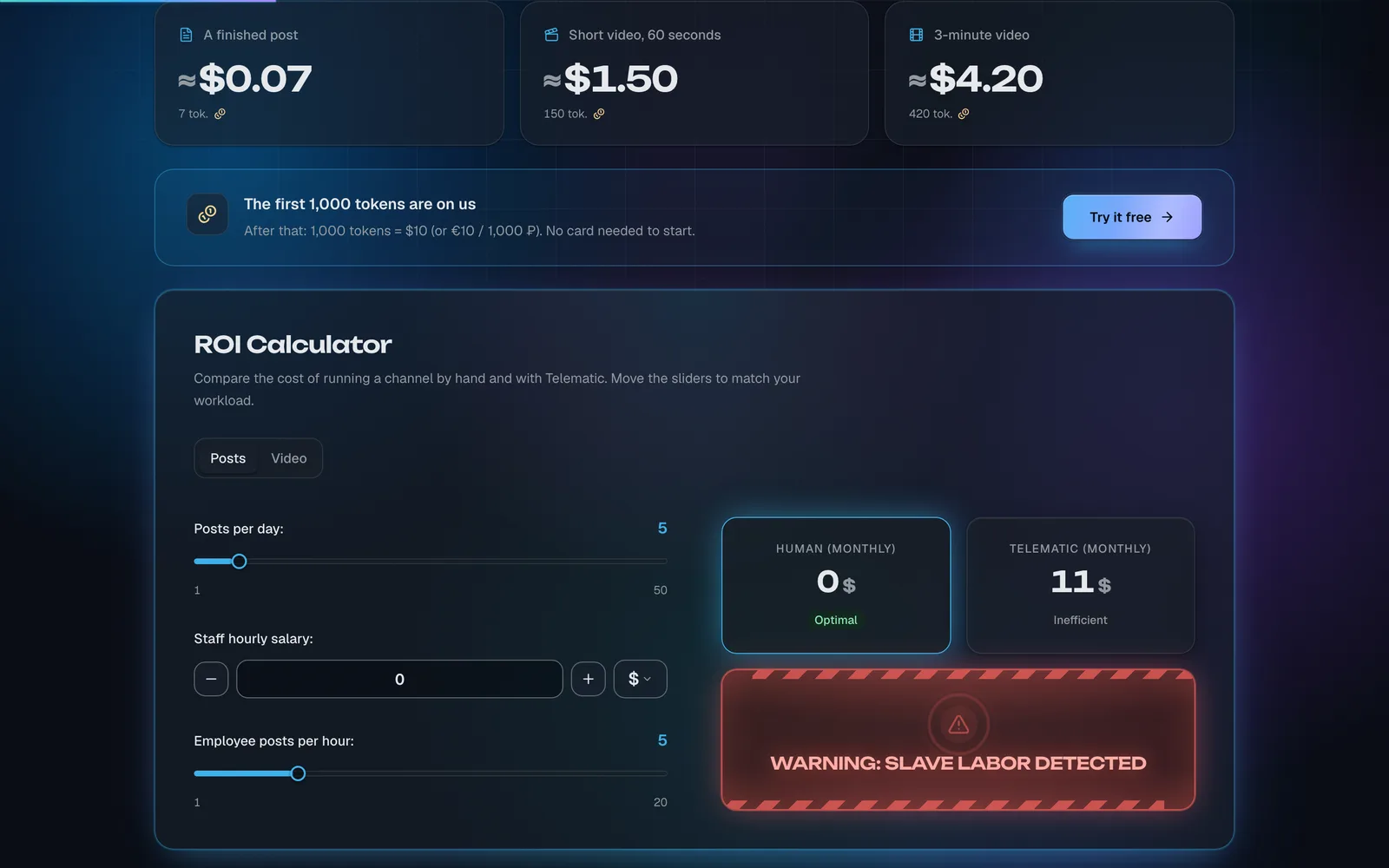
The site used to rely on a dark background with a grid. Now there’s a full-blown aurora living behind it:
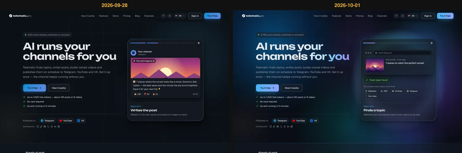
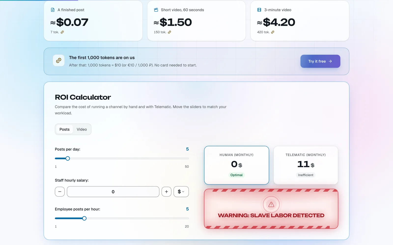
The light theme has a palette of its own — Pearl: a pastel sky and a pink-and-peach gradient instead of a plain white background.
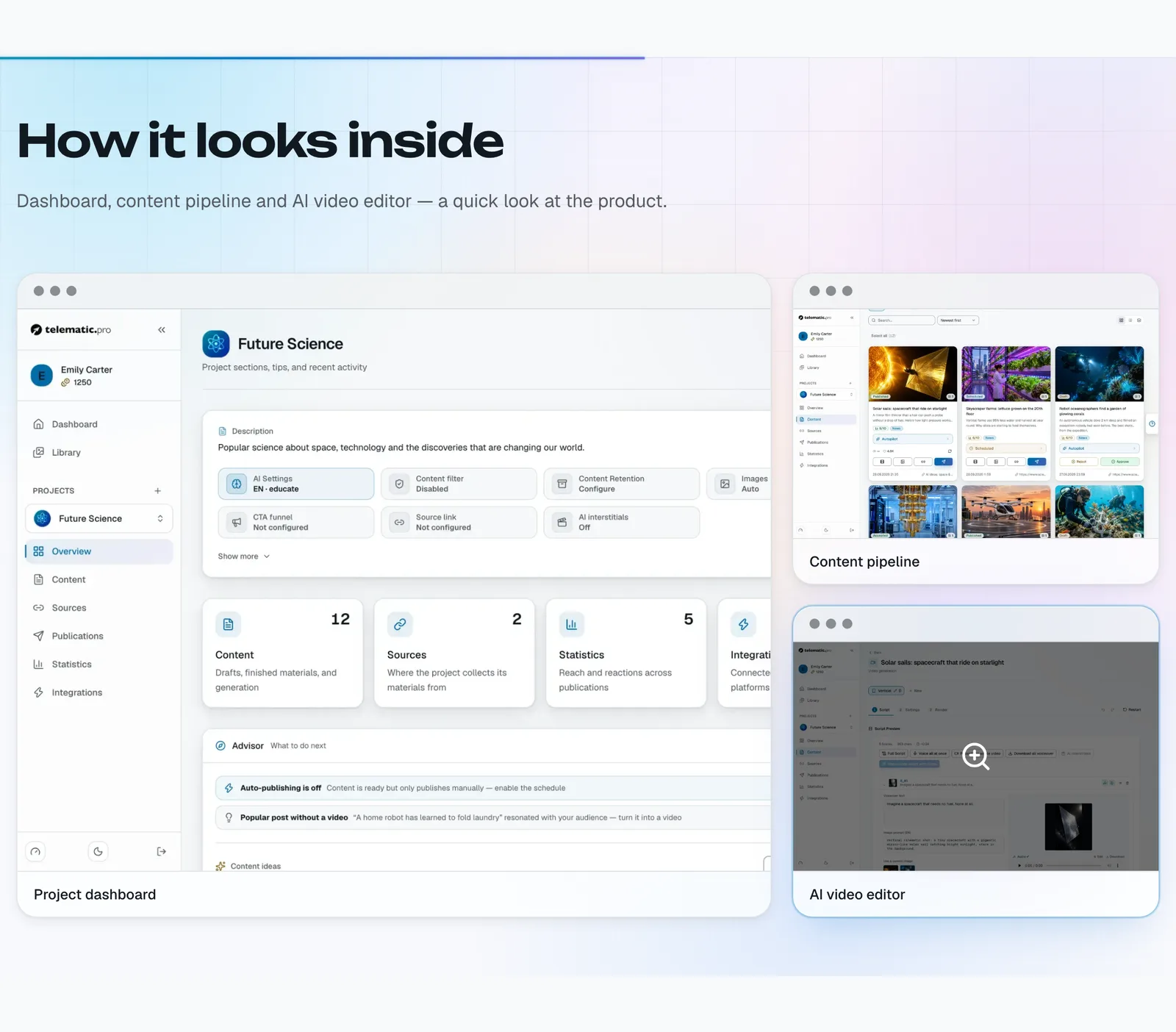
Beautiful, but fast
Rich graphics can easily weigh a site down. That’s why Aurora runs in two modes. On the public site the background is shown in all its glory, while inside the app it switches to a calmer version so nothing distracts you from work. Power-saving mode stops endless animations, the glass blur only kicks in on powerful devices, and the system “reduce motion” setting turns animation off entirely. Card and panel transparency stays the same in every mode, so the interface always feels cohesive.
Consistent form controls
Native browser dropdowns, checkboxes and sliders look different in every browser. We replaced them with our own components in the product’s style — across all settings, the video editor, the admin panel and modal windows. On phones, buttons and fields are now larger, so they’re easy to hit with a finger.
A new balance top-up page
The top-up window has been completely redesigned: every token package now comes with a hint about what you can do with it, the total is shown at the bottom, only the payment methods that are actually available are displayed, and there’s a trust block plus a link to the terms of service. Users know exactly what they’re paying for before they pay.
An Easter egg in the calculator
The pricing page has an ROI calculator that compares the cost of running a channel by hand with running it on Telematic. Try setting the staff hourly salary to 0 — the calculator will sound the alarm, complete with flashing hazard tape and a radar: “Warning: slave labor detected.”
Fresh screenshots in every language
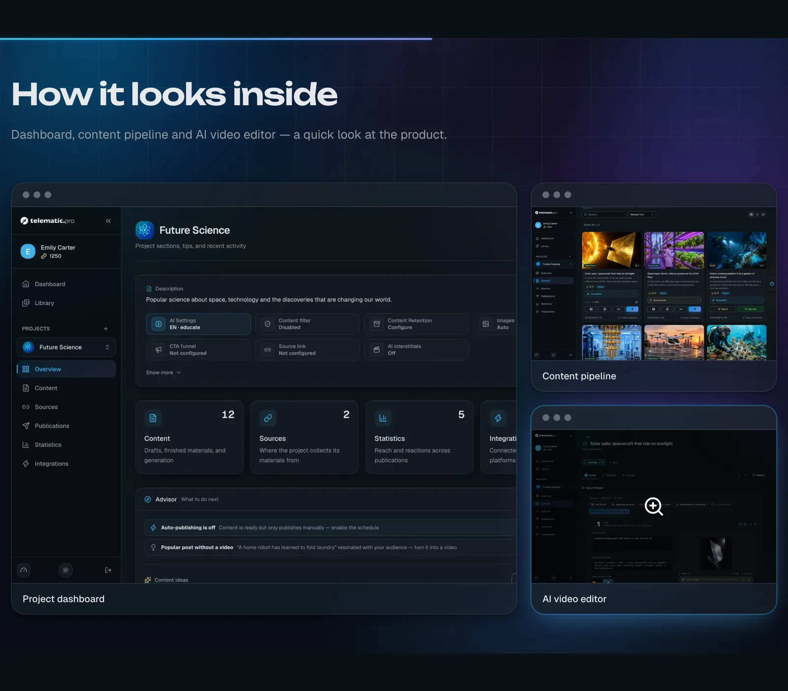
Product screenshots on the landing page are now captured automatically from demo accounts and exist in all 7 languages and both themes, so visitors see the interface in their own language. Along the way, we also fixed a bug that caused very long articles to be rejected by the Feed API.
By the numbers
4 commits, 137 files and about 880 lines of new CSS for the design layer.
You can try the updated service at telematic.pro, and the full case study is in our portfolio.
Want your product to look just as stunning and stay just as fast? Tell us about your project.