Redesigning a 13-Year-Old Website: How to Refresh Everything Without Breaking a Thing
Plenty of companies have a website that was once their pride and joy and now looks like a postcard from the previous decade. Rebuilding it feels risky: there are years of content, hard-won search rankings, user habits — and code nobody wants to touch. We’ve just wrapped up exactly that kind of project — a complete redesign of the SuperSnimki.ru photo community — and here’s how it went.
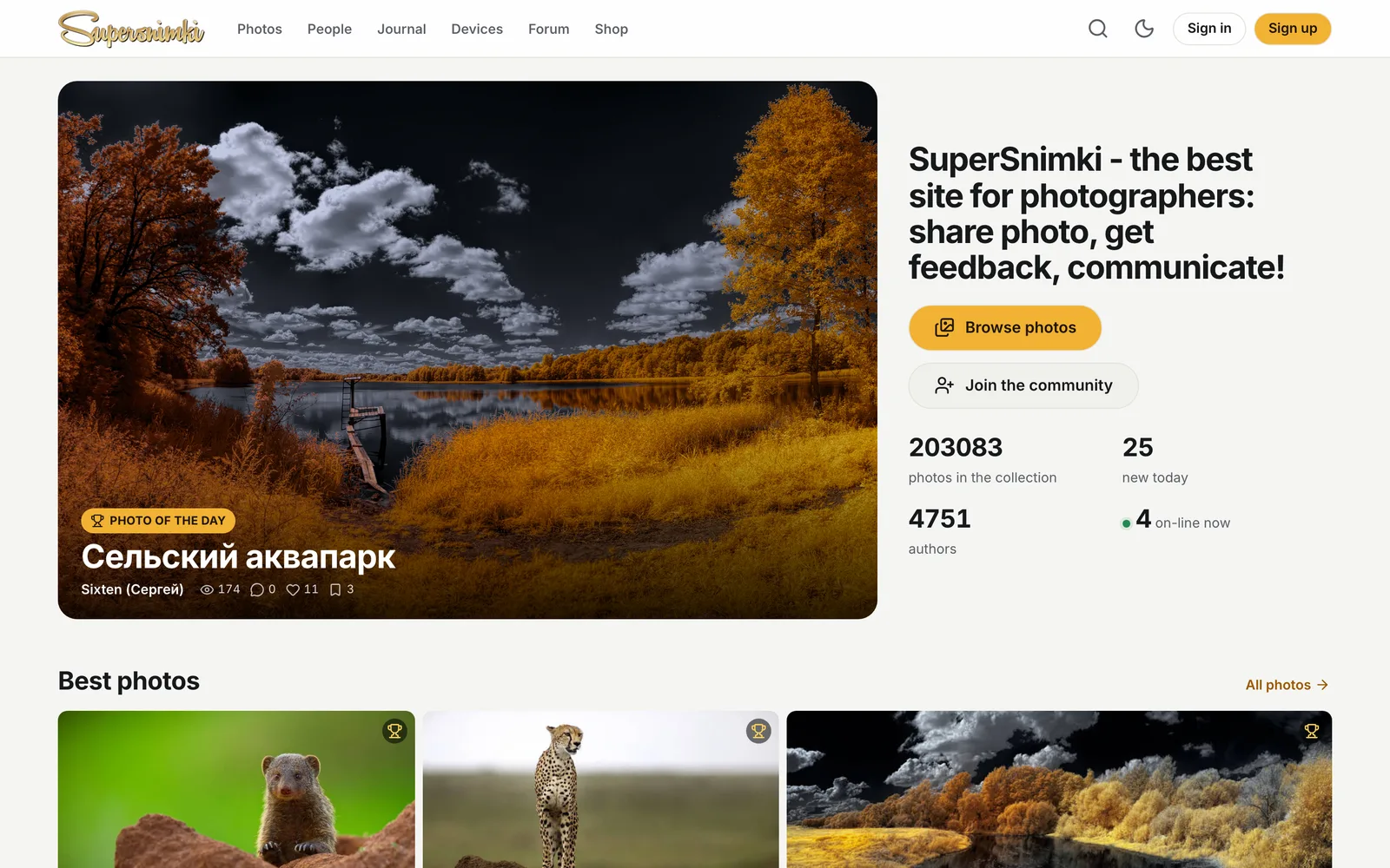
Where it all started
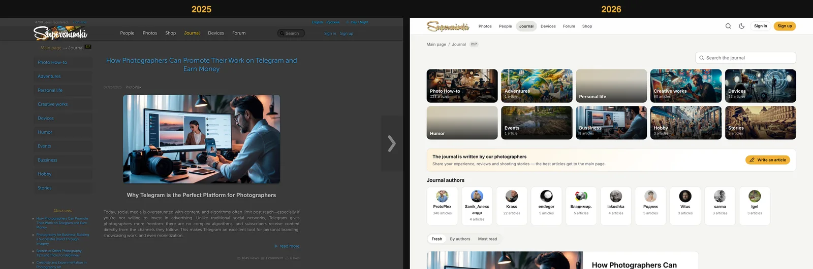
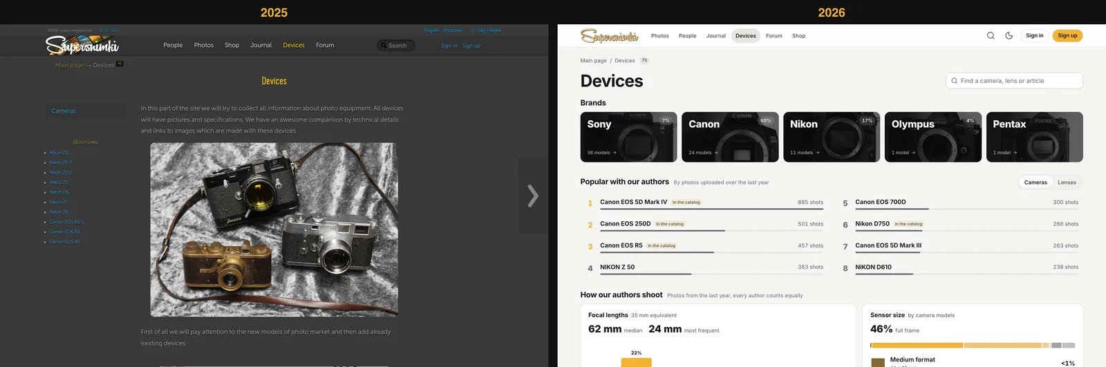
We launched SuperSnimki in 2013. Since then the site has built up more than 200,000 photos from over 4,700 photographers, plus thousands of articles and forum threads. The platform ran reliably, but the interface was stuck in its era:
The key decision: don’t rewrite the platform
The most expensive and risky route is “let’s rewrite everything on a new stack.” We said no to it. The Perl engine, the MongoDB and MySQL databases, the URL structure and the data all stayed exactly as they were. We changed what users see — and whatever was stopping the site from being fast.
That’s why the redesign never turned into a migration: not a single link broke, search rankings didn’t suffer, and users simply opened a familiar site one day to find it transformed.
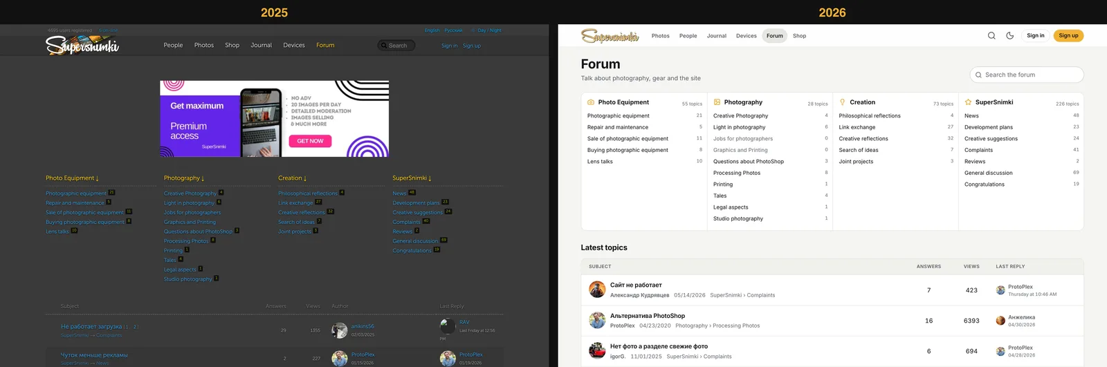
A design system on top of legacy code
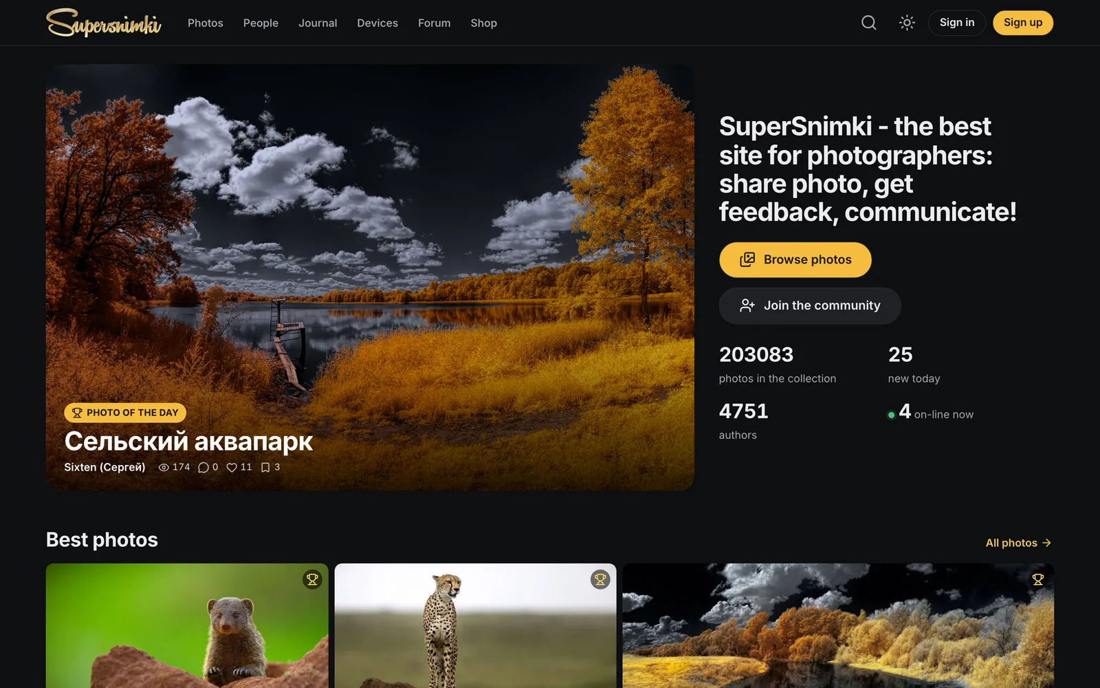
First, we defined the design system as tokens: colors for the light and dark themes, a type scale, spacing on a 4 px grid, corner radii and animation durations. All 183 of the site’s templates were moved onto these tokens — which is why dark mode worked everywhere at once, not just on the home page.
One small trick saved a lot of time: the 130 new SVG icons got the same class names as the old icon-font glyphs. We didn’t have to rewrite a single template for the icons — they simply started looking new.
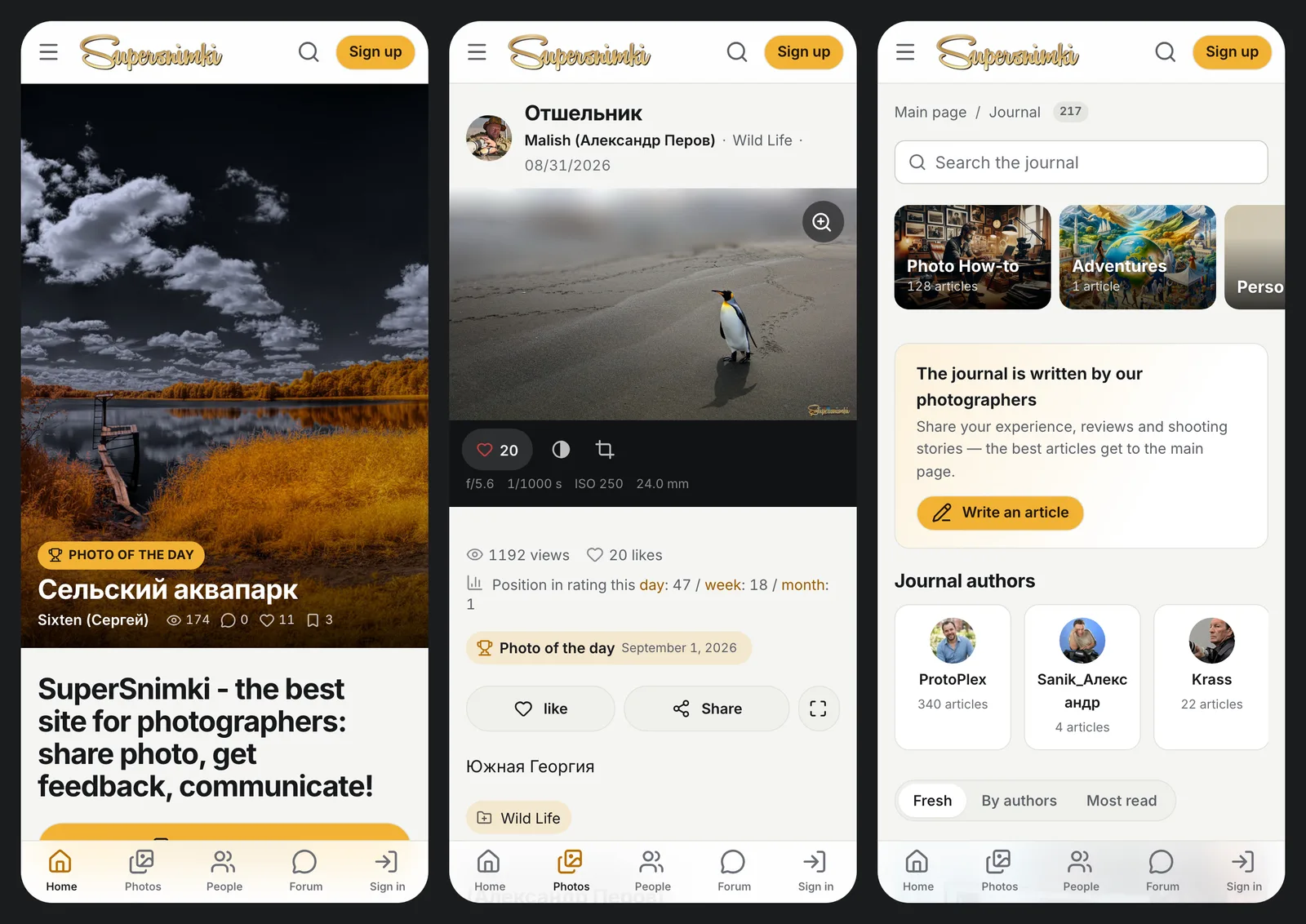
A mobile experience that feels like an app
These days most of the audience browses photos on their phones. So we added a bottom navigation bar with an upload button in the center, a slide-out menu and a new full-screen viewer with pinch-to-zoom, swipes and double-tap. The site can be added to the home screen, just like an app.
Speed: remove more than you add
Redesigns often make a site heavier. Ours did the opposite:
The result: the codebase is 27,000 lines smaller — even though it gained features.
New reasons to come back
A good redesign isn’t just about looks. Along with it, we added the things people come back for:
Security and SEO along the way
When you go through every template, you also spot what has gone unnoticed for years. We closed XSS vulnerabilities in search, comments and the forum, protected deletions with CSRF tokens, brought back proper 404s, fixed RSS, extended the JSON-LD markup and added images to the sitemap.
What your project can take from this
The full case study with screenshots is in our portfolio, and you can see the updated site live at supersnimki.ru.
If your site is overdue for a refresh but touching it feels scary, tell us about your project and we’ll put together a redesign plan where nothing gets lost.